


Diagnosis
First, let's start with a simple acknowledgment of what we can learn about the company from the website.
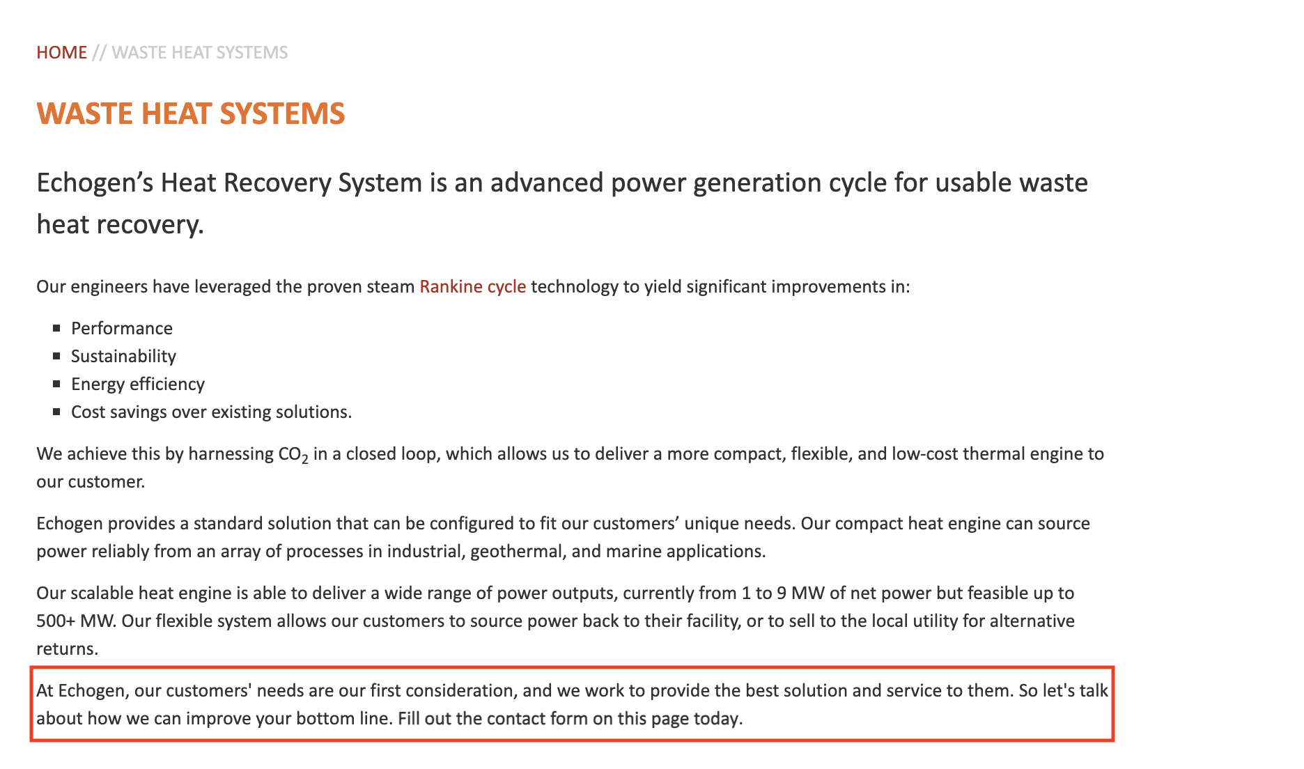
1. They have two main products: Heat Recovery Systems and Electro-Thermal Energy Storage (ETES) systems. The first is commercially active, the second is in development.

2. The company's unique advantage seems to rely on the combination of their two products. They are one of the few companies in the world (according to Bard) that is developing and implementing both industrial waste heat recovery systems and ETES systems. Their clients can turn waste heat into electricity, store it and discharge it when needed. Our UVP will be built around this assumption.
By looking at the website, I identified a few issues:
- Obscure communication. The website could do a better job at communicating the company's core offerings.
- Outdated design. A fresh restyling could help the company position itself at the edge of innovation.
- Complex navigational structure. The home page should be richer in content and help navigate the user to the right pages. Product pages have nested subpages for benefits, overview, etc. There is no need for that.
- Missed SEO opportunity. By having a quick look at Semrush, I can see that there's a lot of low difficulty keywords the company could rank for to drive traffic.
- Buried social proof. To find information about clients / collaborators, the visitor needs to navigate to About > Our people > Partners. In addition, the company has received a grant from the U.S. Department of Energy. This should be featured more prominently.
- Bad mobile experience. The website is slow on mobile and, overall, not optimized for mobile visitors.
Approach
Here is what I would do:
- Reorganize website structure for a more enjoyable user experience and SEO performance.
- Sleek, responsive design to make a great first impression and look more modern, innovative.
- Display social proof more prominently.
- Add case studies to show successful applications of the technology.
- Evaluate investment in SEO. I'm sure there are a lot of high-value, low-difficulty keywords to be targeted.
Let's begin.
New website structure
I would reorganize the website like this:
- Home
- Products
- Heat recovery systems
- ETES - Applications
- e.g. Oil & Gas
- e.g. Renewable energy
- e.g. Manufacturing - Case studies
- Case study
- Case study - Blog
- Article
- Article - About
- Contact
I have limited the number of hierarchy levels to one, which makes the website easier to navigate. There is no need for deeper hierarchies.
The choice to build a landing page for each industry / application is motivated by both UX and SEO:
- UX. I suspect visiting a landing page personalized for your industry would increase the likelihood of you becoming a client.
- SEO. These landing pages could also target industry-specific long-tail keywords (E.g. Solar power plant heat recovery system?). These represent golden opportunities to attract highly targeted traffic.
Case studies are great to build trust and demonstrate successful applications of the technology.
Blog articles should target long-tail keywords. Thought-leadership pieces would be great for social media (linkedin) and link building. They tend to be shared and linked to quite easily.
Redesign
As explained above, I only redesigned the home page as it would take me too long to design the whole website. You've already seen the redesigned page above, let's now dive into the explanation.
Direction
I kept the original mix of dark and light themes. The color palette is derived from the brand's orange.
Navbar
I simplified the navbar and added mega menus to organize information logically.


I have also added a CTA to the navbar that would lead to a contact page.
Hero

The hero section now clearly states what the company is about. I added this sunset (or sunrise?) picture to convey feelings of power, warmth. It also matches the color palette and the sun is a clear association with energy. I slapped a grid I found on Freepik on top of it for a bit of flair.
Social proof

Added a social proof section right after the hero. It serves the purpose of validating the legitimacy and reputation of Echogen Power Systems from the get go.
Products

Added a section to showcase products. The headline embodies the company's UVP. Another option could be to have two separate sections, one for each product. Clicking on a product card leads to the respective product's landing page.
Applications

This section displays possible applications of the technology. Don't mind the copy, I quickly put something together with the help of AI. Once again, clicking on a card leads to the application's landing page.
Case study

Next, I included a section to feature a case study.
Blog

I also added a blog section to display a few articles.
CTA

A simple CTA section that invites the website visitor to contact Echogen to become a partner.
Footer

And last but surely not least.. the footer. I would argue the footer is one of the most important elements of your website. Don't ask me why, but a big, juicy footer immediately conveys a sense of trust. Want to look serious? Have a big footer.
Actually, the reason for this phenomenon is simply attributable to a cognitive bias known as "associative thinking", which consists in making assumptions or judgments about something based on its association with something else. Almost all big companies have big footers because they have very large websites. Hence, if your company has a big footer, people will subconsciously assume you're big.
Conclusion
That's it! Thank you for reading.